Usage
Chips allow users to enter information, make selections, filter content, or trigger actions. While buttons are expected to appear consistently and with familiar calls to action, chips should appear dynamically as a group of multiple interactive elements.
Principles

Compact
Chips are compact components that represent discrete information.

Relevant
Chips should have a clear and helpful relationship to the content or task they represent.

Focused
Chips should make tasks easier to complete, or content easier to sort.
Types

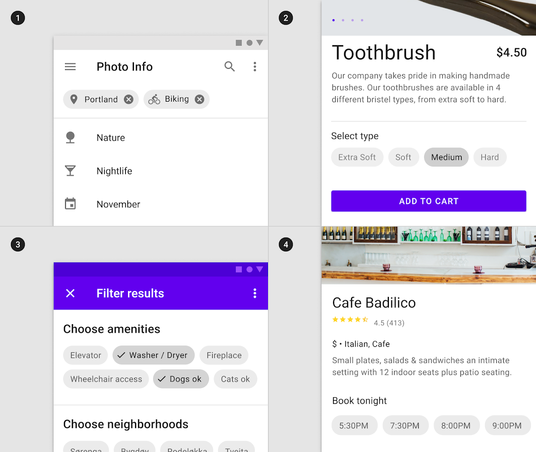
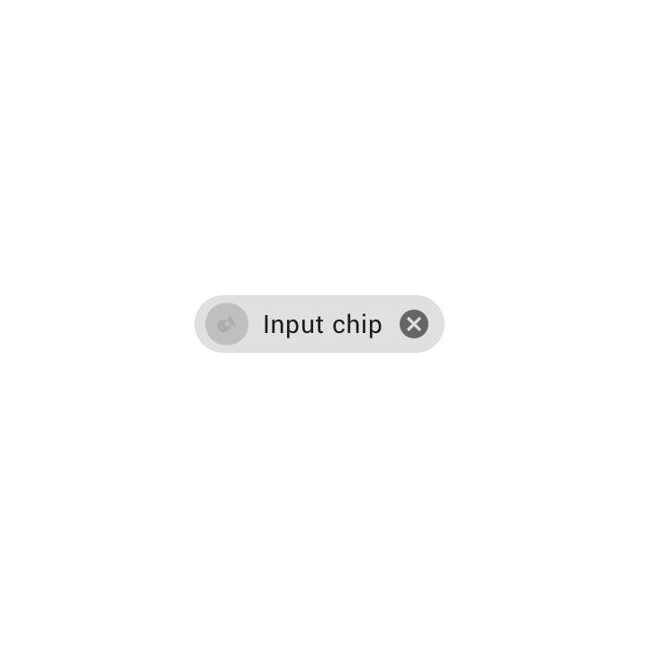
Input chips represent information used in fields, such as an entity or different attributes.

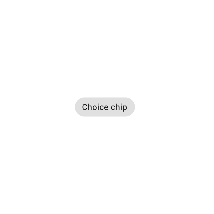
In sets that contain at least two options, choice chips represent a single selection.

Filter chips represent filters for a collection.

Action chips trigger actions related to primary content.
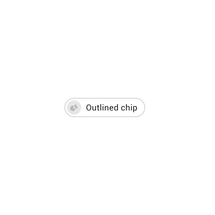
Anatomy
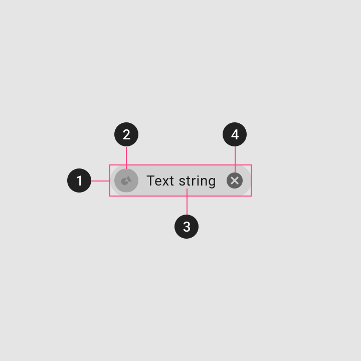
1. Container
Chip containers hold all chip elements, and their size is determined by those elements. A container can also be defined by a stroke.
2. Thumbnail [optional]
Thumbnails identify entities (like individuals) by displaying an avatar, logo, or icon.
3. Text
Chip text can be an entity name, description, tag, action, or conversational.
4. Remove icon [optional]
Input chips can include a Remove icon.
Input chips
Usage
Input chips represent a complex piece of information in compact form, such as an entity (person, place, or thing) or text. They enable user input...
Input chips represent a complex piece of information in compact form, such as an entity (person, place, or thing) or text. They enable user input and verify that input by converting text into chips.


Behavior
Input chips are predictive, editable, movable, expandable, and appear in groups.
Transformative
Input chips transform text based on user input.
Editable
An input chip’s text is editable until the user takes an action with the chip, such as sending an email. To edit an input chip’s text, tap the chip.
Informational
If text input is not recognized by the system, input chips can display an error state.

Multiple
A single field can contain multiple input chips.
Movable
Input chips can be reordered or moved into other fields.
Expandable
Input chips can expand to show more information or options. A container transform transition pattern is used to reveal additional content.
Placement
Input chips work together with other UI elements.
Input chips can be integrated with other components. They can appear:
- Inline with the text input cursor in a field
- In a stacked list
- In a horizontally scrollable list

States
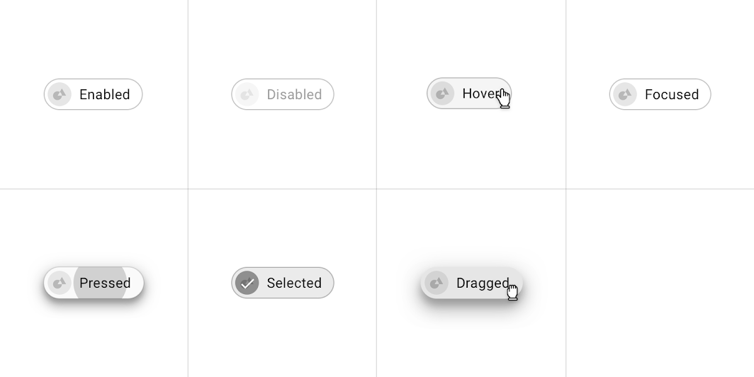
Input chips states


Choice chips
Usage
Choice chips allow selection of a single chip from a set of options. Choice chips clearly delineate and display options in a compact area. They...
Choice chips allow selection of a single chip from a set of options.
Choice chips clearly delineate and display options in a compact area. They are a good alternative to toggle buttons, radio buttons, and single select menus.


Placement
Choice chips appear as part of a series of other choice chips. They are typically displayed horizontally and sequentially. An overlay is a semi-transparent covering...
Choice chips appear as part of a series of other choice chips. They are typically displayed horizontally and sequentially.


States
Choice chips states


Filter chips
Usage
Filter chips use tags or descriptive words to filter content. Filter chips clearly delineate and display options in a compact area. They are a good...
Filter chips use tags or descriptive words to filter content.
Filter chips clearly delineate and display options in a compact area. They are a good alternative to toggle buttons or checkboxes.


Placement
Filter chips can live with other elements in a UI.


States
Choice chips states

Action chips
Usage
Action chips offer actions related to primary content. They should appear dynamically and contextually in a UI. An alternative to action chips are buttons, which...
Action chips offer actions related to primary content. They should appear dynamically and contextually in a UI.
An alternative to action chips are buttons, which should appear persistently and consistently.


Placement
Action chips are displayed after primary content, such as below a card or persistently at the bottom of a screen. Buttons allow users to take...
Action chips are displayed after primary content, such as below a card or persistently at the bottom of a screen.


States
Choice chips states


Theming
Reply Material theme
This email app’s input chips have been customized using Material Theming. Areas of customization include color, typography, and shape. Reply is an email app that...
This email app’s input chips have been customized using Material Theming. Areas of customization include color, typography, and shape.

Color
Reply’s input chips use custom color on two elements: text, container.

| Element | Category | Attribute | Value |
|---|---|---|---|
| Text | On Surface | Color Opacity |
#232F34 100% |
| Container | On Surface | Color Opacity |
#232F34 12% |
Typography
Reply’s input chips use custom typography for the text.

| Element | Category | Attribute | Value |
|---|---|---|---|
| Text | Body 2 | Typeface Font Size Case |
Work Sans Regular 15 Sentence case |
Shape
Reply’s input chip containers have custom corner shapes.

| Element | Category | Attribute | Value |
|---|---|---|---|
| Container | Small component | Family Size |
Rounded 50% |
Shrine Material theme
Choice chips with customized shape, color, and typography.
This retail app’s choice chips have been customized using Material Theming. Areas of customization include color, typography, and shape.

Color
Shrine’s choice chips use custom color on four elements: selected container, selected text, unselected container, and unselected text.

| Element | Category | Attribute | Value |
|---|---|---|---|
| Selected container | Primary | Color Opacity |
#FEDBD0 100% |
| Selected text | On Primary | Color Opacity |
#442C2E 100% |
| Unselected text | On Surface | Color Opacity |
#442C2E 100% |
| Unselected container | On Surface | Color Opacity |
#442C2E 12% |
Typography
Shrine’s choice chips use custom typography for the text.

| Element | Category | Attribute | Value |
|---|---|---|---|
| Text | Body 2 | Typeface Font Size Case |
Rubik Medium 14 Sentence case |
Shape
Shrine’s choice chip containers have custom corner shapes. Shrine’s chips use an override of the small component shape category family and size values.

| Element | Category | Attribute | Value |
|---|---|---|---|
| Container | Override* | Family Size |
Rounded 4dp;4dp;4dp;4dp |
Fortnightly Material theme
Filter chips with customized shape, color, and typography.
This news app’s filter chips have been customized using Material Theming. Areas of customization include color, typography, and shape.
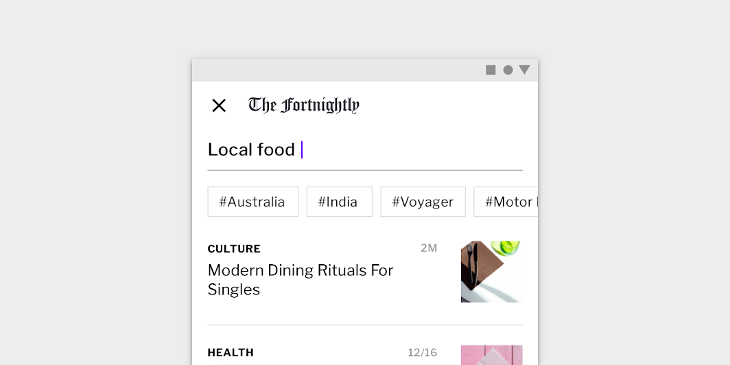
Color
Fortnightly’s filter chips use custom color on two elements: text, and container stroke.

| Element | Category | Attribute | Value |
|---|---|---|---|
| Text | On Surface | Color Opacity |
#000000 87% |
| Container stroke | On Surface | Color Opacity |
#000000 12% |
Typography
Fortnightly’s filter chips use custom typography for the text.

| Element | Category | Attribute | Value |
|---|---|---|---|
| Text | Body 2 | Typeface Font Size Case |
Libre Franklin Regular 14 Title case |
Shape
Fortnightly’s filter chip containers have custom corner shapes, with 0dp cut corners.

| Element | Category | Attribute | Value |
|---|---|---|---|
| Container | Small component | Family Size |
Cut 0dp;0dp;0dp;0dp |
Specs
Action chip
- Measurement 32
- Measurement 12
- Measurement 12
- Measurement C

Outlined action chip
- Measurement 4
- Measurement 12
- Measurement 8
- Measurement 1
- Measurement 32
- Measurement 24
- Measurement C
Choice chip
- Measurement 12
- Measurement 12
- Measurement 32
- Measurement C
Choice chip
- Measurement 12
- Measurement 12
- Measurement 32
- Measurement C
Filter chip
- Measurement 12
- Measurement C
- Measurement 32
- Measurement 12

Filter chip
- Measurement 12
- Measurement C
- Measurement 32
- Measurement 12
Input chips
- Measurement 4dp
- Measurement 8
- Measurement 8
- Measurement 32
- Measurement C
- Measurement 24
- Measurement 18
- Measurement 8
Input chips
- Measurement 4dp
- Measurement 8
- Measurement 8
- Measurement 32
- Measurement C
- Measurement 24
- Measurement 18
- Measurement 8
Chips in groups
- Measurement 8