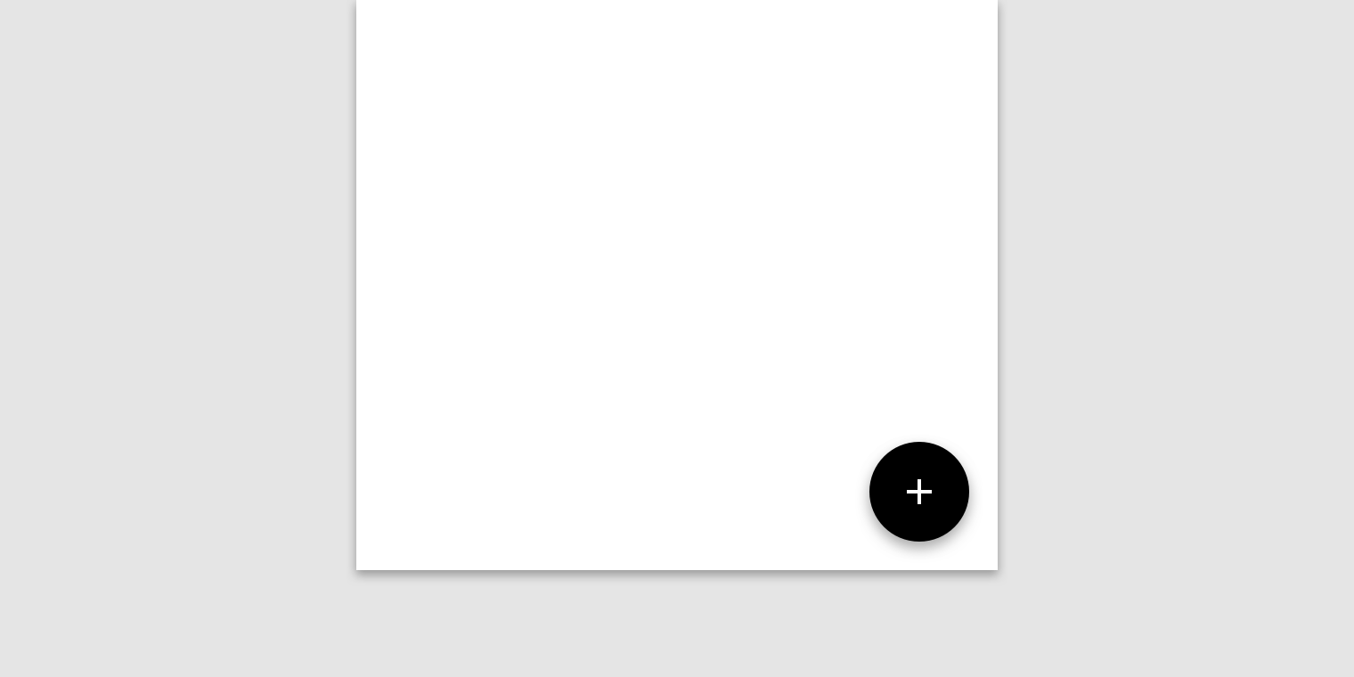
Interactive demo
This demo lets you preview the FAB component, its variations, and configuration options. Each tab displays a different type of FAB.
Usage
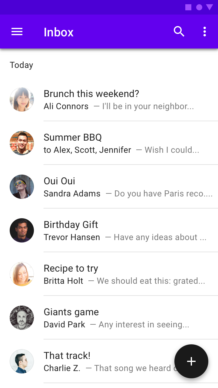
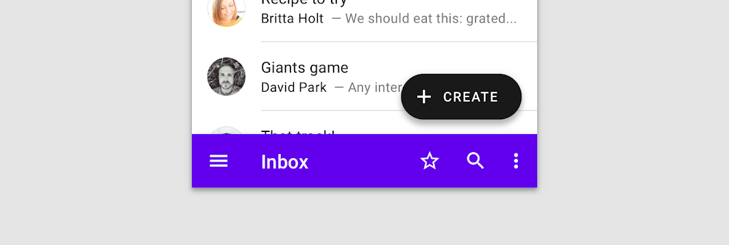
A floating action button (FAB) performs the primary, or most common, action on a screen. It appears in front of all screen content, typically as a circular shape with an icon in its center. FABs come in three types: regular, mini, and extended.
Only use a FAB if it is the most suitable way to present a screen's primary action.


Principles

Primary
A FAB represents the primary action on a screen.

Constructive
A FAB should perform a constructive action (such as create, share, or explore).

Contextual
A FAB should be relevant to the screen on which it appears.
Anatomy

2. Icon
Container
The FAB is typically displayed in a circular container. An app's color scheme determines its color fill, which should contrast with the area behind the...
The FAB is typically displayed in a circular container. An app's color scheme determines its color fill, which should contrast with the area behind the FAB.

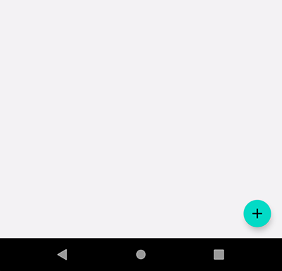
1. Default (56 x 56dp)
2. Mini (40 x 40dp)
A mini FAB should be used on smaller screens. When a screen width is 460dp or less, the container of a default FAB (56dp) should transform into the mini size (40dp).
Mini FABs can also be used to create visual continuity with other screen elements.


Icon
A FAB's icon should clearly illustrate its action. A FAB shouldn’'t contain notifications or actions found elsewhere on a screen.
A FAB's icon should clearly illustrate its action. A FAB shouldn't contain notifications or actions found elsewhere on a screen.


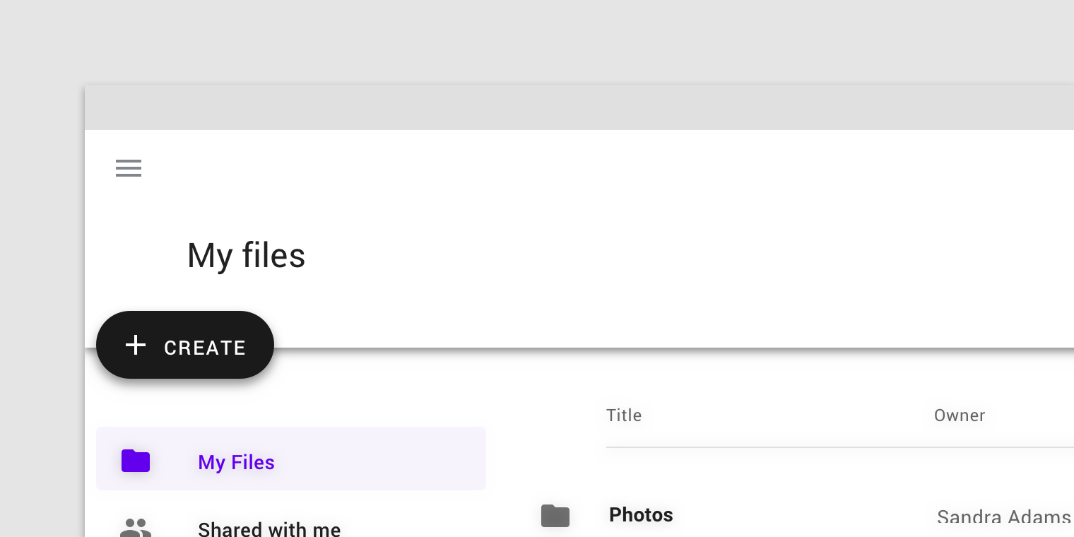
Placement
FABs can attach to top app bars and the edge of some components.


Behavior
Actions
A floating action button (FAB) can trigger an action either on the current screen, or it can perform an action that creates a new screen....
A floating action button (FAB) can trigger an action either on the current screen, or it can perform an action that creates a new screen.
A FAB promotes an important, constructive action such as:
- Create
- Favorite
- Share
- Start a process
Avoid using a FAB for minor or destructive actions, such as:
- Archive or trash
- Alerts or errors
- Limited tasks like cutting text
- Controls better suited to a toolbar (like controls to adjust volume or font color)


Types of transitions
Speed dial
When pressed, a FAB can display three to six related actions in the form of a speed dial. This transition can occur in one of...
When pressed, a FAB can display three to six related actions in the form of a speed dial. This transition can occur in one of the following ways:
- Upon press, the FAB can emit related actions
- Upon press, the FAB can transform into a menu containing related actions (Android only)
If more than six actions are needed, something other than a FAB should be used to present them.
Emit related actions
Upon press, the FAB remains visible and emits a stack of related actions. If the FAB is tapped in this state, it should either initiate its default action or close the speed dial actions.


Transform into a menu with the related actions
Upon press on Android, the FAB can transform into a menu containing related actions. A scrim indicates that functionality outside of the action menu is temporarily disabled. The menu remains on-screen until an action, or the scrim, is tapped.
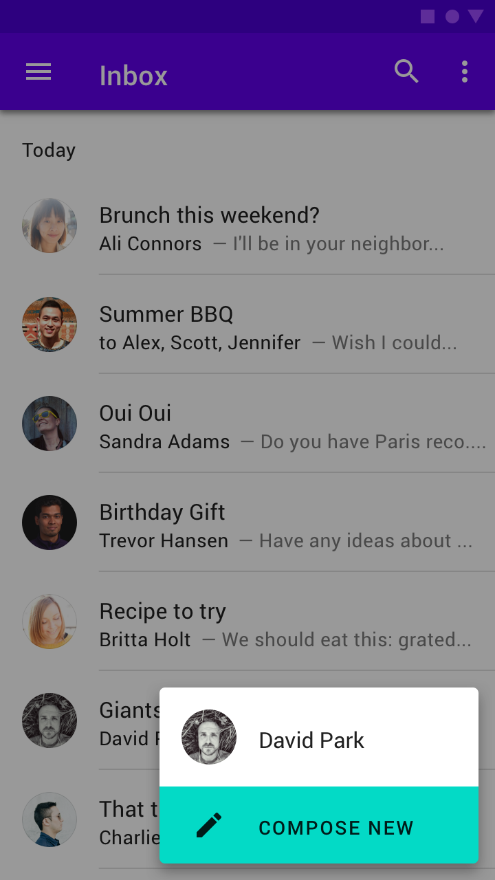

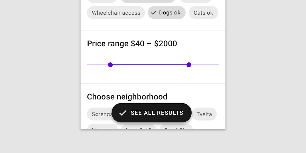
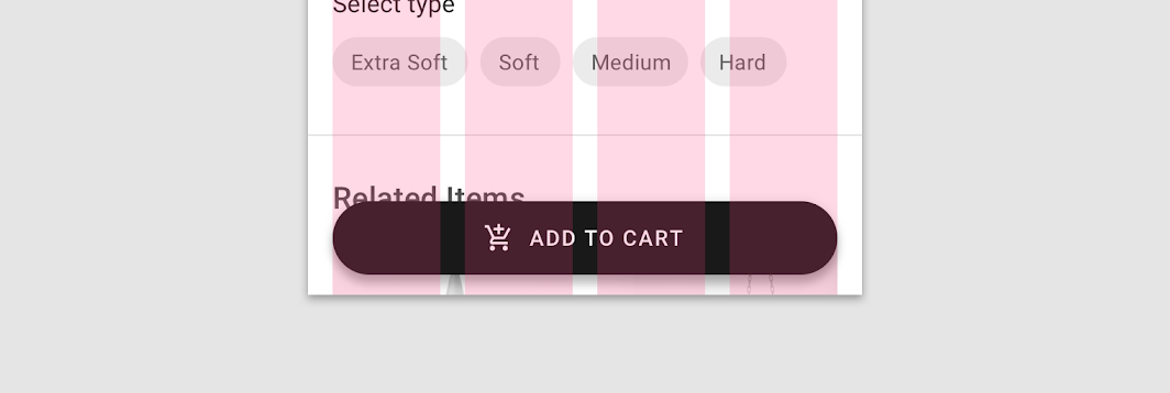
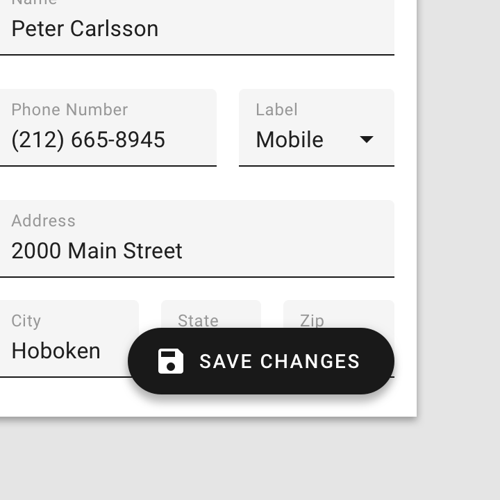
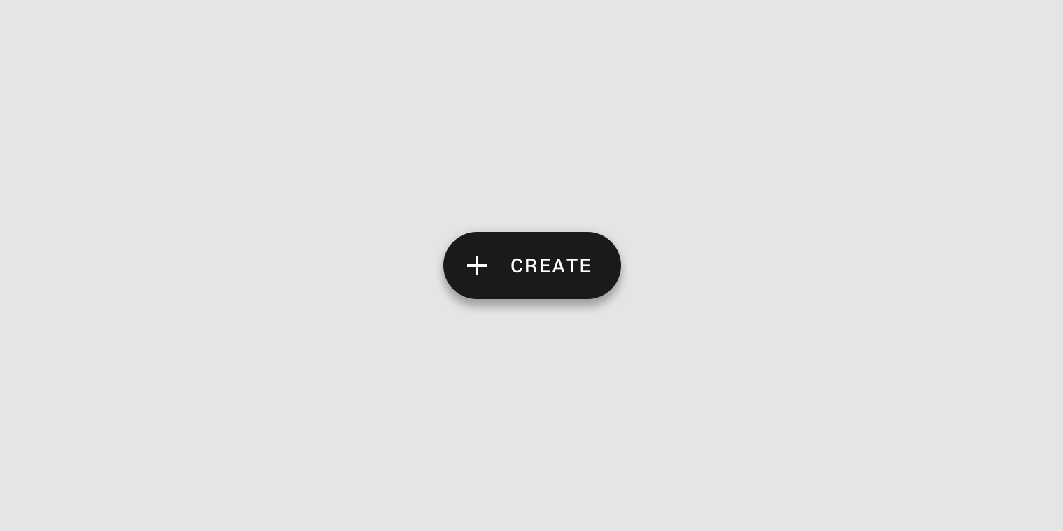
Extended FAB
The extended FAB is wider, and it includes a text label.
Anatomy
The width of an extended FAB’s container can be fixed or fluid. The icon of an extended FAB should intuitively represent its action. The text...

2. Icon (optional)
3. Text label
Container
The width of an extended FAB’s container can be fixed or fluid.
- A fixed width container is defined by the cumulative width of the icon, text label, and padding.
- A fluid width container is defined by its relationship to something else on screen, such as screen width or the layout grid.

Icon
The icon of an extended FAB should intuitively represent its action.


Text label
The text label of an extended FAB should describe its action.


Placement
The extended FAB can be positioned in the center, left, or right side of a screen. For UIs larger than 840dp, such as desktop, the...
The extended FAB can be positioned in the center, left, or right side of a screen.
Desktop and tablet
For UIs larger than 840dp, such as desktop, the extended FAB should be placed at the top left of the screen, or at the bottom right of the screen.


Mobile
On mobile, the extended FAB should be placed at the bottom right or bottom center.


Theming
Reply Material Theme
This email app’s floating action button has been customized using Material Theming. Areas of customization include color and shape. Reply is an email app that...
This email app's floating action button has been customized using Material Theming. Areas of customization include color and shape.

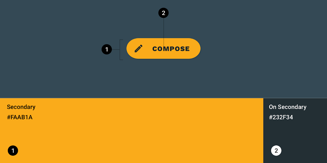
Color
Reply's extended FAB uses custom color on two elements: the container, icon, and text.
| Element | Category | Attribute | Value |
|---|---|---|---|
| Container | Secondary | Color Opacity |
#FAAB1A 100% |
| Icon | On Secondary | Color Opacity |
#232F34 100% |
| Text | On Secondary | Color Opacity |
#232F34 100% |
Typography
Reply's extended FAB uses custom typography on its button text.

| Element | Category | Attribute | Value |
|---|---|---|---|
| Text | Button | Typeface Font Size Case |
Work Sans ExtraBold 15 All caps |
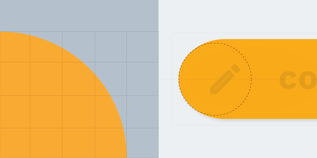
Shape
Reply's floating action button uses a custom shape on the container.
| Element | Category | Attribute | Value |
|---|---|---|---|
| Container | Small component | Family Size |
Rounded 50% |
Posivibes Material Theme
This social media app's floating action button has been customized using Material Theming. Areas of customization include color and shape. The Material Design color system...
This social media app's floating action button has been customized using Material Theming. Areas of customization include color and shape.

Color
Posivibe's FAB uses custom color on two elements: the container and icon.

| Element | Category | Attribute | Value |
|---|---|---|---|
| Container | Secondary | Color Opacity |
#000000 100% |
| Icon | On Secondary | Color Opacity |
#FFFFFF 100% |
Shape
Posivibes' FAB uses a custom shape on its container. *Posivibes' FABs use an override of the small component shape category size value.

| Element | Category | Attribute | Value |
|---|---|---|---|
| Container | Override* | Family Size |
Cut 50% |
Shrine Material Theme
This retail app's extended floating action button has been customized using Material Theming. Areas of customization include color, typography, and shape. The Material Design color...
This retail app's extended floating action button has been customized using Material Theming. Areas of customization include color, typography, and shape.

Color
Shrine's extended FAB uses custom color on two elements: the container and text.

| Element | Category | Attribute | Value |
|---|---|---|---|
| Container | Primary | Color Opacity |
#FEDBD0 100% |
| Text | On Primary | Color Opacity |
#442C2E 100% |
Typography
Shrine's extended FAB uses custom typography on its button text.

| Element | Category | Attribute | Value |
|---|---|---|---|
| Text | Button | Typeface Font Size Case |
Rubik Medium 14 All caps |
Shape
Shrine's extended FAB uses a custom shape on its container.

| Element | Category | Attribute | Value |
|---|---|---|---|
| Container | Small component | Family Size |
Cut 4;4;4;4dp |
Specs
Floating action button
#000000ff R0 G0 B0 A1.00 Elevation 6dp All corners Rounded: 28dp All measurements are displayed in device-independent pixels (dps) #000000ff R0 G0 B0 A1.00 Elevation...
Regular
- Measurement 56
- Measurement 16
- Measurement 16
- Measurement C
- Measurement 24

Mini FAB
- Measurement 40
- Measurement 8
- Measurement 8
- Measurement C
- Measurement 24
Placement
- Measurement 16
- Measurement 16
Extended floating action button
14dp #ffffff #000000ff R0 G0 B0 A1.00 Elevation 6dp All corners Rounded: 32dp All measurements are displayed in device-independent pixels (dps) Elevation 6dp All corners...
- Measurement 48
- Measurement 12
- Measurement 12
- Measurement 20
- Measurement C
- Measurement 24
Placement
- Measurement 8