Data tables

Data tables display sets of data across rows and columns.

Android Not available Web Flutter iOS Not available

Interactive demo

This demo lets you preview the data table component and its configuration options.


Usage

Data tables display information in a grid-like format of rows and columns. They organize information in a way that’s easy to scan so that users can look for patterns and develop insights from data.

Data tables can contain:

  • Interactive components (such as chips, buttons, or menus)
  • Non-interactive elements (such as badges)
  • Tools to query and manipulate data

Principles

Organized

Information should be organized in a meaningful way, such as hierarchy or alphabetization.

Interactive

Data tables should allow user interaction so that a data display is customizable and interactive.

Intuitive

Data tables should be easy to use, with a logical structure that makes content easy to understand.


Anatomy

Diagram of a data table labeling the 5 parts of its anatomy
1. Header row
2. Rows
3. Pagination
4. Row checkbox
5. Sort button
6. Container

Data table elements

Baseline elements

Column header names describe the type of content displayed in each column. Each row contains data related to a single entity. 

Interactive elements

Data tables can include interactive elements, such as:

  • Checkboxes 
  • Sorting (on columns)
  • Icons that communicate alerts
  • Pagination

Pagination or filter chips: Controls that manipulate how table data is displayed should be placed directly above or below a table.

Two active filter chips applied to a data table with many pages
Above the header row, a filter bar shows two active filters. Pagination is shown below the bottom row.


Columns

The baseline row height is 52dp, and the column header row height is 56dp (4dp taller than regular rows).

Height and padding

The baseline row height is 52dp, and the column header row height is 56dp (4dp taller than regular rows).

Data table diagram showing the different heights for a header row and baseline row

Padding

There is 32dp or more of padding between columns.

Data table diagram showing the padding between columns
There is 16dp padding on the left and right side of each header name.

Text

Column header text uses a medium weight font to differentiate from row text.

Text that is longer than the column width is truncated with an ellipsis. On hover, a tooltip shows the full name.
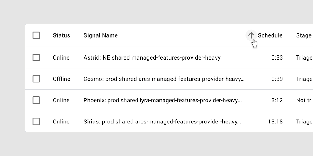
Data table with 4 header items and 1 header item with truncated text
Long column headers are truncated with an ellipsis.
Tooltip showing full text when hovering over truncated text
Hovering over a truncated column header reveals a tooltip that displays the full text.

Sorting

To help users sort information, a column can display column sorting by default.

To help users sort information, column can be displayed sorting by default.

To indicate which column is sorted by default, place a downward or upward arrow icon next to the column header’s name.

Downward arrow next to a column header item indicating sorting
Sorting by signal name in descending order is indicated with a downward arrow next to the column header name.

Reversing sort order

To reverse the sort order of a column, a user taps the header name or arrow icon. Upon sorting, the arrow icon reverses direction.

Data table showing ascending sorting order
Sorting by the schedule column in ascending order is indicated with an upward arrow.
Data table results reversed to show descending sorting order
A table sorted in reverse: the downward arrow shows that the schedule column is sorted in descending order.

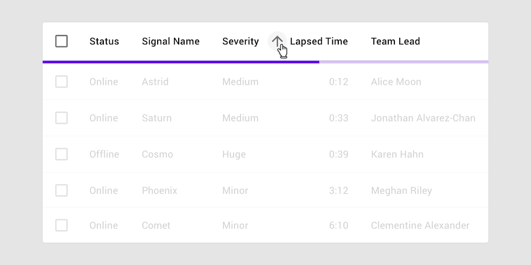
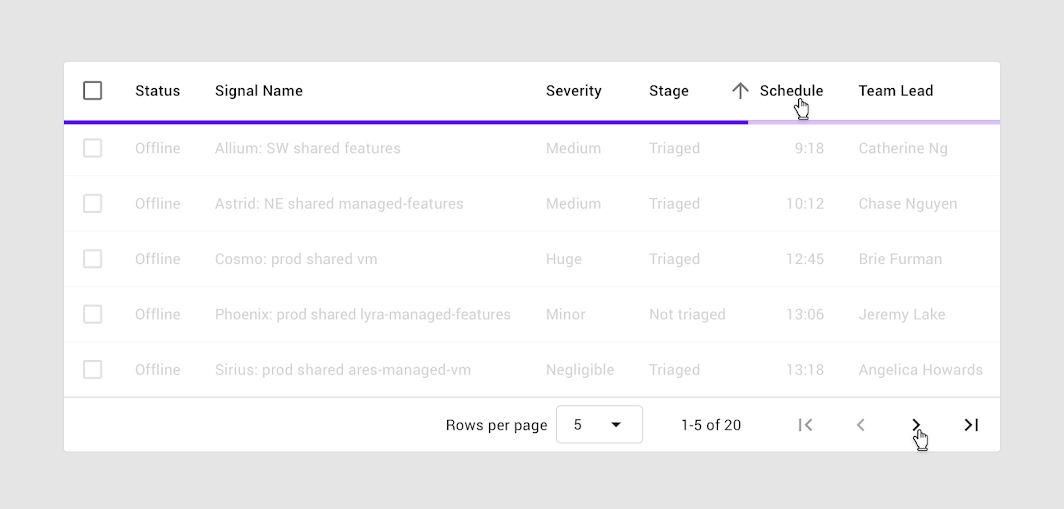
Sorting with a progress indicator

A linear progress indicator is used in data tables when sorting is initiated. The progress indicator communicates to users that sorting is in process.

Data table showing linear progress indicator after interacting with a column sort
A linear progress indicator signals that sorting is in process.

Row checkbox

When a row checkbox is selected, the row should display a background color.

When a row checkbox is selected, the row should display a background color.

For people who use screen magnification, the selected checkbox may appear outside of the magnified screen area. The addition of a background color fill provides an additional way to indicate that a row has been selected.

For more information on selection states, visit States.

Data table with two selected rows
A selected row checkbox with background color fill on the entire row.

Behavior

Row hover (Desktop)

When a user hovers over a row, that row displays a background color.

When a user hovers over a row, that row displays a background color.

Data table with cursor hovering on one row
A row that displays a background color on hover.

Column hover (Desktop)

When the user hovers over a column header:

When the user hovers over a column header:

  • A tooltip can display the full column name (if it’s truncated) or a more detailed description of the column
  • If sorting is enabled, an arrow icon can appear next to the column header
Data table showing hover states for headers with truncated text and enabled sorting
A tooltip or a downward or upward arrow icon can be displayed when hovering over a column name. Two cursors are displayed for demonstration purposes.

Focus

When using keyboard focus, an indicator appears as users tab through interactive items (such as checkboxes).

When using keyboard focus, an indicator appears as users tab through interactive items such as checkboxes.

Data table showing keyboard focus state for checkbox
Keyboard focus on the checkbox

Inline menus

Inline menus allow selection from a predefined set of menu items. They're embedded directly in a table cell. Menus display a list of choices.

Inline menus allow selection from a predefined set of menu items. They're embedded directly in a table cell.

Data table with inline menus
A table with inline menus
Data table with expanded inline menu showing two predefined options
An expanded inline menu

Pagination

Pagination controls provide swift access to all pages, while indicating that more pages exist. They display: Pagination is placed at the bottom of a table.

Pagination controls provide swift access to all pages while indicating that more pages exist.

Pagination controls display:

  • Number of rows per page
  • Total number of rows, including the range currently in view
  • Left and right arrows for navigating pages

Placement

Pagination is placed at the bottom of a table.

Data table showing pagination controls positioned at the bottom of the table
25 rows per page are displayed, with a total of 100 rows.

Pagination menus show a predefined list of options for the quantity of rows to display.

Pagination controls include a dropdown menu that has predefined options on rows per page
Dropdown menus are used in the pagination section of the table to allow selection of rows-per-page.
Progress indicator appears under the header row after interacting with sort or pagination
A progress indicator can be used with sorting or pagination. Two cursors are displayed for demonstration purposes.

Theming

Rally Material Theme

The Rally personal finance app’s data tables have been customized using Material Theming. The areas of customization include color, typography, and shape. Rally is a...

Color

Rally’s data tables use custom color on four elements: the container, table text, header text, and dividers.

Diagram pointing out four aspects of a data table that are themeable including the container, table title, header text and dividers
Element Category Attribute Value
Container Surface Color
Opacity
#3C3C46
100%
Table text On Surface Color
Opacity
#FFFFFF
100%
Header text On Surface Color
Opacity
#FFFFFF
60%
Divider On Surface Color
Opacity
#FFFFFF
12%

Typography

Rally’s data tables use custom typography for table text.

Custom type, Roboto Condensed, applied to sample text
Element Category Attribute Value
Text Body 2 Typeface
Font
Size
Case
Roboto Condensed
Regular
14
Title case

Shape

Rally’s data tables have custom corner shapes, with 0dp long cut corners.

Square corners applied to shape system for Rally
Element Category Attribute Value
Container Large component Family
Size
Cut
0;0;0;0dp

Specs

Target area

The minimum touch target for interactive elements is 48 x 48 dp.

Diagram of touch target for checkbox
Touch target size for a checkbox or any other interactive element: 48 x 48dp

Element bounds

Targets can extend areas beyond the bounds of an element.

Diagram for icon size
Icon size: 40 x 40dp

Table cell padding

Table cell padding is minimized to improve content density.

Diagram for padding in table cells
• Table cell top & bottom padding: 6dp
• Table cell left padding: 8dp

Corner radius

Data tables have a rectangular shape by default, with subtly rounded corners.

Diagram highlighting the rounded corners on a data table
Table corner radius: 4dp

Elevation

Data tables don’t express elevation as they're often in front of solid color backgrounds. They also don’t move in front of or behind other surfaces.

Diagram highlighting no elevation is applied to data tables
Elevation: 0dp

Container outline

An outline can separate a table from either another table or other components.

Diagram highlighting the container used for data tables
Container outline: 1dp

Height and padding

Diagram of height and padding for rows and columns
• Header row height: 56dp
• Row height: 52dp (4dp shorter than the header row)
• Padding: 16dp
• Container dimensions expand to fit content

Numeric alignment

Align numbers to the right for improved scannability.

Diagram highlighting right-alignment for a column that holds numerical data
Numbers in the column are right-aligned with the column header name
No Android implementation guidance available

Using data tables

Data tables display information in a grid-like format of rows and columns. They organize information in a way that’s easy to scan, so that users can look for patterns and insights.

Data tables can contain:

  • Interactive components (such as chips, buttons, or menus)
  • Non-interactive elements (such as badges)
  • Tools to query and manipulate data

Installation

Styles

Note: Styles for any components you intend to include within data-table (e.g. Checkboxes, Buttons etc.) must be loaded.

JavaScript instantiation

See Importing the JS component for more information on how to import JavaScript.

Instantiating MDCDataTable component is only required to add interactions for example, row selection.

MDC Data Table component auto instantiates MDCCheckbox for header row checkbox and all row checkboxes. Make sure to set required class names to instantiate checkbox component. We suggest to use layout API when rows are added or removed from data table to register new checkbox components.

Making data tables accessible

Please refer to the WAI-ARIA Authoring Practices for table for the ARIA recommended role, states and properties required for table element.

Data tables

Data table currently supports following features.

Standard data table

Use this to render data table without any interactivity such as row selection, sorting, etc.

Data table with row selection

The row selection feature allows users to select table rows via row checkboxes. Users can select or unselect all rows using the header row checkbox. Additionally, the header row checkbox will be automatically updated based on the checked status of each row's checkbox, whether it was checked manually or programmatically.

HTML Structure

JavaScript APIs

  • Use layout() API when new row checkboxes are added or removed from data table.
  • Programmatically get / set row selection using following API's:
    • getSelectedRowIds()
    • setSelectedRowIds(string[])

Data table with pagination

Pagination is rendered at the footer section of data table. Pagination helps user change the rows per page (page size) and navigate between data table pages.

HTML Structure

JavaScript APIs

Data table component does not provide any JavaScript APIs for pagination.

  • Should manually initialize following components supporting pagination feature:
    • Select component: Used to change rows per page (page size).
    • Icon button: Used to navigate between data table pages.
  • Should re-render data table content when rows per page is changed or navigated to another page using events triggered by select & pagination button.
  • Should manually enable or disable pagination buttons accordingly when data table reaches first or last page.

Data table with progress indicator

Progress indicator inform users about the status of ongoing processes, such as data loading. Indeterminate linear progress indicator along with a scrim is shown on blocking the table content.

HTML Structure

JavaScript APIs

  • Use showProgress() and hideProgress() API to show or hide the progress indicator.
  • Data table component will automatically initializes the linear progress indicator subcomponent.

Events

Following events are emitted for row selection feature.

Event constantEvent nameEvent detailDescription
ROW_SELECTION_CHANGEDMDCDataTable:rowSelectionChangedMDCDataTableRowSelectionChangedEventDetailEvent emitted when row checkbox is checked or unchecked.
SELECTED_ALLMDCDataTable:selectedAllvoidEvent emitted when header row checkbox is checked.
UNSELECTED_ALLMDCDataTable:unselectedAllvoidEvent emitted when header row checkbox is unchecked.

Data table with column sorting

The column sorting feature allows users to reorder table rows in ascending or descending order by a column.

The data table handles sorting as follows:

  • Triggers event when sort icon button is clicked.
  • Flips the sort icon based on sort direction.
  • Sets appropriate ARIA attributes based on sort status.

Data table consumer should re-render the table body (rows) in sorted order on events.SORTED event.

HTML Structure

Set data-column-id on sortable header cell element to uniquely identify column that needs to be sorted.

Events

Event constantEvent nameEvent detailDescription
SORTEDMDCDataTable:sortedSortActionEventDetailEvent emitted when clicked on sortable header cell.

Style customization

CSS classes

CSS ClassDescription
mdc-data-tableMandatory. The root DOM element containing table and other supporting elements.
mdc-data-table--sticky-headerOptional. Modifier class name added to root element to make header row sticky (fixed) on vertical scroll. (Note: Sticky header feature is not compatible with IE11 browsers.)
mdc-data-table__table-containerMandatory. Container of Table element. Used for horizontal overflowing of table content.
mdc-data-table__tableMandatory. Table element. Added to table HTML tag.
mdc-data-table__header-rowMandatory. Table header row element. Added to thead > tr HTML tag.
mdc-data-table__header-cellMandatory. Table header cell element. Added to thead > tr > th HTML tag.
mdc-data-table__header-cell--checkboxOptional. Table header cell element that contains mdc-checkbox. Added to thead > tr > th HTML tag.
mdc-data-table__header-cell--numericOptional. Table header cell element that maps to numeric cells. Added to thead > tr > th HTML tag.
mdc-data-table__contentMandatory. Table body element. Added to tbody HTML tag.
mdc-data-table__rowMandatory. Table row element. Added to tbody > tr HTML tag.
mdc-data-table__cellMandatory. Table cell element. Added to tbody > tr > td HTML tag.
mdc-data-table__cell--numericOptional. Table cell element that contains numeric data. Added to tbody > tr > td HTML tag.
mdc-data-table__cell--checkboxOptional. Table cell element that contains mdc-checkbox. Added to thead> th > td:first-child HTML tag.
mdc-data-table__header-row-checkboxOptional. Checkbox element rendered inside table header row element. Add this class name to mdc-checkbox element to override styles required for data-table.
mdc-data-table__row-checkboxOptional. Checkbox element rendered inside table row element. Add this class name to mdc-checkbox element to override styles required for data-table.
mdc-data-table__row--selectedOptional. Modifier class added to mdc-data-table__row when table row is selected.
mdc-data-table__header-cell--sortedOptional. Modifier class added to header cell element if column is sorted.
mdc-data-table__header-cell--sorted-descendingOptional. Modifier class added to header cell element if column is sorted in descending order.
mdc-data-table__header-cell--with-sortOptional. Modifier class added to header cell element if column supports sorting.
mdc-data-table__header-cell-wrapperMandatory. Container of header cell label and sort button, used to align header cell in center.
mdc-data-table__sort-icon-buttonOptional. Class name added to icon button used as sort icon button. This is sibling to header cell label.
mdc-data-table__header-cell-labelMandatory. Class name added to header cell label. Child to header cell wrapper element.
mdc-data-table__sort-status-labelOptional. Class name added to sort status label which is visually hidden. Only visible to screen reader users.
mdc-data-table__paginationRoot element of pagination. Pagination block element is rendered as immediate child to data table root element.
mdc-data-table__pagination-trailingImmediate child of pagination. Used to wrap pagination content.
mdc-data-table__pagination-rows-per-pageContainer of rows per page label and rows per page select.
mdc-data-table__pagination-rows-per-page-selectClass name added to select component used for changing rows per page (page size).
mdc-data-table__pagination-navigationBlock element containing all icon buttons used to navigate between data table pages.
mdc-data-table__pagination-buttonClass name added to icon button component used to navigate between data table pages.
mdc-data-table__progress-indicatorBlock element rendered as immediate child to data table root element. Contains linear progress and scrim blocking the data table content.
mdc-data-table__scrimElement blocking data table content. Rendered inside progress indicator root element.
mdc-data-table__linear-progressClass name added to linear progress component. Rendered inside progress indicator root element.

Sass mixins

See _mixins.scss file for up-to-date code documentation of Data table theme APIs.

MDCDataTable properties and methods

See component.ts file for up-to-date code documentation of Data table component APIs.

Usage within web frameworks

If you are using a JavaScript framework, such as React or Angular, you can create a Data Table for your framework. Depending on your needs, you can use the Simple Approach: Wrapping MDC Web Vanilla Components, or the Advanced Approach: Using Foundations and Adapters. Please follow the instructions here.

See MDCDataTableAdapter and MDCDataTableFoundation for up-to-date code documentation of Data table foundation APIs.

No Web implementation guidance available

Using data tables

Data tables display information in a grid-like format of rows and columns. They organize information in a way that’s easy to scan, so that users can look for patterns and insights.

Data tables can contain:

  • Interactive components (such as chips, buttons, or menus)
  • Non-interactive elements
  • Tools to query and manipulate data

Making data tables accessible

Flutter's APIs support accessibility setting for large fonts, screen readers, and sufficient contrast. For more information, go to Flutter's accessibility and internationalization pages.

For more guidance on writing labels, go to our page on how to write a good accessibility label.

Data tables information

PaginatedDataTable

Demo table without Theme

Key properties

The following is an anatomy diagram of a data table:

Data table anatomy diagram

A data table consists of the following properties:

  1. Container
  2. Column header names
  3. Sort button
  4. Row checkboxes
  5. Rows

Container

 Property
Colorstyle
Stroke colorwhile setting ThemeData fill out dividerColor parameter

Column header names

 Property
Label textUse columns, within Column set create DataColumn widget fill out label property with Text Widget
TypographyWithin the Text widget from note above fill out style property with TextStyle widget
ColorWithin the Text widget from note above fill out style property with TextStyle widget fill out the color property

Sort button

Sorting button can't be customized.

Row checkboxes

 Property
active Colorwhile setting ThemeData fill out accentColor

Rows

 Property
Label textUse DataCell widget, fill out with property with Text Widget
TypographyWithin the Text widget from note above fill out style property with TextStyle widget
ColorWithin the Text widget from note above fill out style property with TextStyle widget fill out the color property

Theming data tables

Data Table cells children are Widgets. This means that the Data table is dependent on the Widgets that the user puts within it. The only theme variables that affect the DataTable is:

  • dividerColor
  • secondaryHeaderColor
  • accentColor

The following is an example data table using the Shrine theme.

Dartpad demo

Demo table with Theme

No Flutter implementation guidance available
No iOS implementation guidance available

Up next