Usage
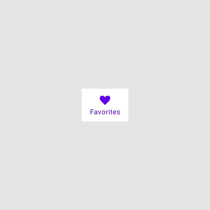
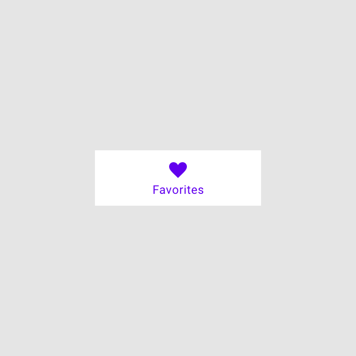
Bottom navigation bars display three to five destinations at the bottom of a screen. Each destination is represented by an icon and an optional text label. When a bottom navigation icon is tapped, the user is taken to the top-level navigation destination associated with that icon.
Principles

Ergonomic
The bottom navigation bar is easy to reach on a handheld mobile device.

Consistent
When used, the bottom navigation bar appears at the bottom of every screen.

Related
Bottom navigation bar destinations should be of equal importance.
When to use
Bottom navigation should be used for top-level destinations
Bottom navigation should be used for:
- Top-level destinations that need to be accessible from anywhere in the app
- Three to five destinations
- Mobile or tablet only
Bottom navigation shouldn’t be used for:
- Single tasks, such as viewing a single email
- User preferences or settings


Image is 50% scale.
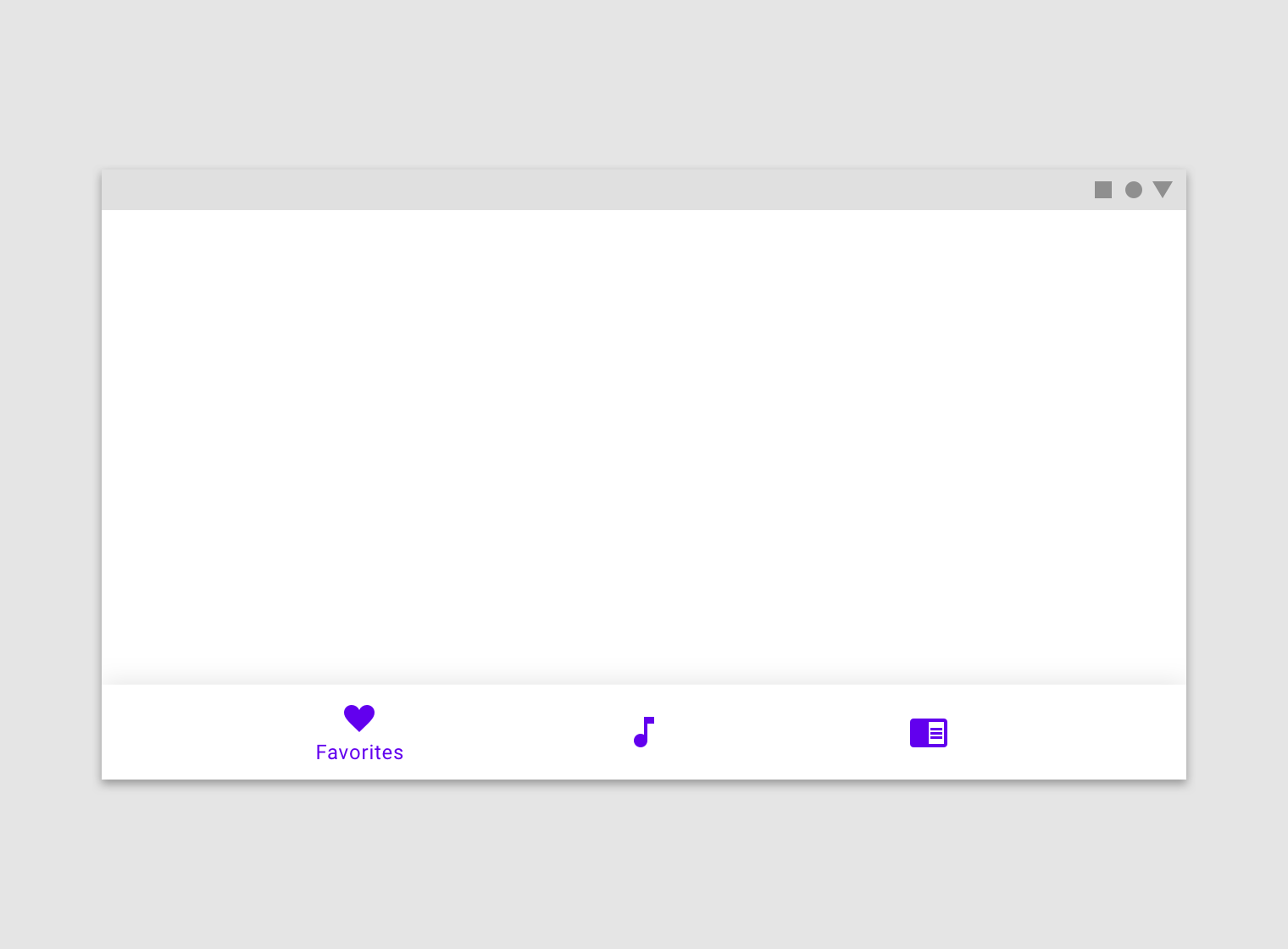
Anatomy

1. Container
2. Inactive icon
3. Inactive text label
4. Active icon
5. Active text label
Representing destinations
The way bottom navigation destinations are represented can depend on how many are used:
The way bottom navigation destinations are represented can depend on how many are used:
- Three destinations: Display icons and text labels for all destinations.
- Four destinations: Active destinations display an icon and text label. Inactive destinations display icons, and text labels are recommended.
- Five destinations: Active destinations display an icon and text label. Inactive destinations use icons, and use text labels if space permits.
Icons
Bottom navigation destinations always include an icon. It’s best to pair icons with text labels, especially if the icon doesn’t have obvious meaning.
Bottom navigation destinations always include an icon. It’s best to pair icons with text labels, especially if the icon doesn’t have obvious meaning.

Text labels
Text labels provide short, meaningful descriptions of bottom navigation destinations.
Text labels provide short, meaningful descriptions of bottom navigation destinations.


Icon & label colors
Active and inactive icons and text labels should have sufficient contrast with the container.
Active and inactive icons and text labels should have sufficient contrast with the container. The active destination’s icon and label should use your app’s Primary or a High-Emphasis “On” color depending on the component’s color scheme. Inactive icons and labels can use the Medium-Emphasis “On” color.


Behavior
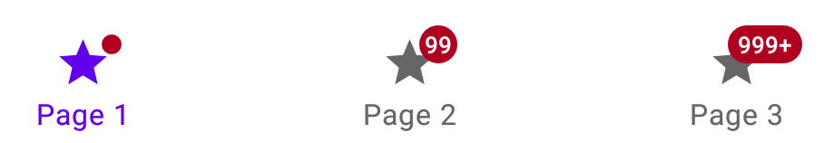
Badges
Bottom navigation icons can include badges in their upper right corner. These badges can contain dynamic information, such as a number of pending requests.
Bottom navigation icons can include badges in their upper right corner. These badges can contain dynamic information, such as a number of pending requests.

2. Badge with a number
3. Badge with a maximum character count
Scaling and adaptation
Only use bottom navigation on mobile and small tablet interfaces. On large screens, swap out bottom navigation bars for a component that’s better suited to large screen contexts.
Component swapping means that components with similar functions are swapped to make changes to an interface that enhance the ergonomics and functionality. Component swapping is triggered by pre-set device breakpoints. When a screen scales beyond a breakpoint, swappable components should change into a more appropriate component for a given screen size.
At medium breakpoints, replace the bottom navigation bar with a navigation rail.
At large breakpoints, replace the navigation rail with a navigation drawer.

Small breakpoints: 360-599dp
For small devices like phones, horizontal space is at a premium; the content area of an app usually spans the entire width of a screen. In this case, smaller navigation components should anchor to the top or bottom of a layout, saving space while making primary destinations accessible.

Medium breakpoints: 600-1239dp
On medium-sized devices like tablets, move primary navigation elements into a navigation rail that is fixed to the leading edge of the layout.
Large breakpoints: 1240dp+
On devices with 1240dp+ widths, present destinations in a permanently visible or dismissible navigation drawer. Assign hierarchy based on how frequently or quickly a user needs to move between destinations.
Placement
Fixed navigation bar
Bottom navigation bar destinations have fixed positions. They don’t scroll or move horizontally.
Bottom navigation bar destinations have fixed positions. They don’t scroll or move horizontally.

Landscape view


States
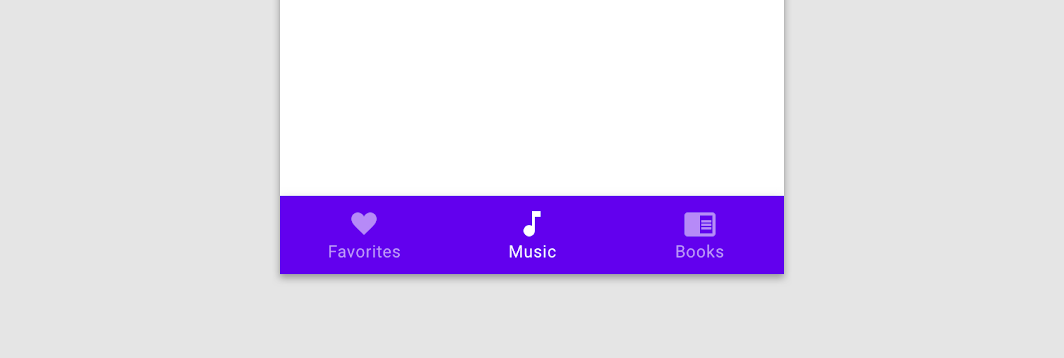
Bottom navigation destinations may be active, inactive, focused or pressed.
Bottom navigation uses opacity and text to show when a destination is active. States are used to show pressed, focused, and unselected states.
Inactive destination states are represented with reduced opacities; active states have full opacity.

2. An active destination
When text labels are not used persistently (at all times), only active destinations are given text labels.
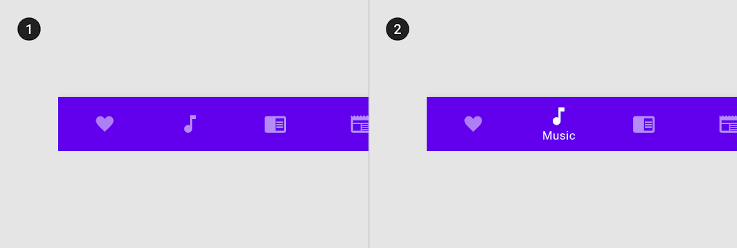
2. An active destination with a text label
Research
Material Design conducted research to understand the usability and design preferences for embedding a floating action button (FAB) in the bottom navigation bar. Preferences and rankings for the different designs were gathered from around 650 participants from the United States, twenty from India and ten from Brazil.
Research findings included:
- Across all locations, participants liked the bottom navigation bar with an embedded, centered FAB because of the aesthetic and ergonomic benefits.
- Across all locations, participants appreciated when navigation or common actions were incorporated in an easy-to-access area like the bottom navigation bar.
- Design preferences for the shape of the bar varied by location. While many participants in the United States and Brazil favored the
mini FAB , participants in India preferred aninset or overlapping FAB .
Theming
Owl Material Theme
This educational app’s bottom navigation bar has been customized using Material Theming. Areas of customization include color and typography. Owl is an educational app that...
This educational app’s bottom navigation bar has been customized using Material Theming. Areas of customization include color and typography.

Color
Owl's bottom navigation bar uses custom color on three elements: the container, activated items, and inactive items.

| Element | Category | Attribute | Value |
|---|---|---|---|
| Container | Primary Blue | Color Opacity |
#0336FF 100% |
| Active icon, active text | On Primary | Color Opacity |
#FFFFFF 100% |
| Inactive icons | On Primary | Color Opacity |
#FFFFFF 76% |
Typography
Owl's bottom navigation bar uses custom typography for text labels.

| Element | Category | Attribute | Value |
|---|---|---|---|
| Text label | Caption | Typeface Font Size Case |
Rubik Regular 12 All caps |
Specs
Mobile
Portrait
- Measurement 56
- Measurement 120
- Measurement 24
- Measurement 12
- Measurement 12
- Measurement 16
- Measurement 16

Minimum width
- Measurement min-width: 80dp
- Measurement 12
- Measurement 12
- Measurement 56
Maximum width
- Measurement 56
- Measurement max-width: 168dp
- Measurement 12
- Measurement 12
- Measurement 8
- Measurement 12
- Measurement 12
Landscape
- Measurement 56
- Measurement max-width: 168dp
- Measurement 12
- Measurement 12
- Measurement 24
- Measurement 16
- Measurement 16
- Measurement 8
- Measurement 12
- Measurement 12