About Owl
Owl is an educational app that provides courses for people who want to explore and learn new skills in design, art, architecture, and fashion. The Owl brand uses bold color, shape, and typography to express its brand attributes: energy, daring, and fun.

Bold aesthetic
Owl’s design reflects the energy and excitement of learning a new skill, using a bold aesthetic that expresses exploration and growth. Its UI contains unfilled shapes that invite the user to populate them with new content and courses. Its copywriting speaks with an inviting, can-do tone of voice.
Product architecture

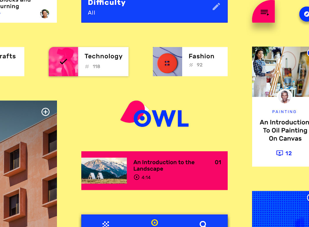
Owl is divided into three sections, each with their own color theme and interaction model:
- Personalize (yellow)
- Browse (blue)
- Learn (magenta)

Hub and spoke structure
The information architecture of the app uses a hub and spoke structure.
The Browse section serves as a “hub,” where various “spokes,” or child nodes, are available to users in the form of instructional classes. After a class is chosen and the user enters the Learn section, the class becomes a hub, with each section of the class becoming a spoke.
This structure applies to the Browse and Learn sections of the app, while the Personalize section is an onboarding section.
Section 1: Personalize
The Personalize section is dedicated to selecting areas of interest. It’s characterized by a yellow theme. This section is a form of onboarding, where customized...
The Personalize section is dedicated to selecting areas of interest. It’s characterized by a yellow theme. This section is a form of onboarding, where customized chips represent selectable course subjects.
Navigation
Navigation can be accessed by tapping the blue floating action button in the lower right corner.Settings can be accessed through the settings icon.

Section 2: Browse
The Browse section is a hub for the user’s areas of interest. It’s characterized by a blue theme. This section contains three top-level navigation destinations:...
The Browse section is a hub for the user’s areas of interest. It’s characterized by a blue theme.
Navigation
This section contains three top-level navigation destinations:
- My Courses
- Featured
- Search
On mobile, Owl uses a bottom navigation bar to access these sections.


On tablet and desktop, rail navigation provides access to the three destinations.

Section 3: Learn
This section is a hub for course content. Each course has an overview screen that contains tutorial videos. To access the tutorial videos for a...
This section is a hub for course content. Each course has an overview screen that contains tutorial videos.
Navigation
To access the tutorial videos for a course, tap the curved shape in the bottom right of the screen. To navigate back to the Browse section, tap the back arrow (in the top left of the screen).


On desktop and tablets in landscape orientation, there is enough screen space to show both the course overview content and videos.

On smaller desktop views and tablets in portrait orientation, videos are hidden by default, but they can be revealed by accessing a side sheet.

Layout
Color
Owl has three primary colors. Each color is used to create a distinct visual theme for each section.

Theme 1
For the Personalize section, yellow is the primary color, and blue is the secondary color.
For the Personalize section, yellow is the primary color, and blue is the secondary color.

Theme 2
For the Browse section, blue is the primary color, and yellow is the secondary color.
For the Browse section, blue is the primary color, and yellow is the secondary color.

Theme 3
For the Learn section, pink is the primary color.
For the Learn section, pink is the primary color.

Typography
Type scale
Owl’s type scale provides the typographic variety necessary for the app content. All items in the type scale use Rubik as the typeface, and make...
Owl’s type scale provides the typographic variety necessary for the app content. All items in the type scale use

Rubik
Owl uses the Rubik typeface. Rubik is sans serif, with slightly rounded corners, and has many font weights.
Owl uses the Rubik typeface.


Iconography
Owl’s iconography reflects the curved shape and style of it’s brand typeface Rubik.

2. A collection of Owl’s icons.
Shape
Categories
Components are grouped into shape categories based on their size. Shape categories let you set multiple component values at once. Shape categories include:
Components are grouped into shape categories based on their size. Shape categories let you set multiple component values at once. Shape categories include:
- Small components
- Medium components
- Large components


2. Medium components
3. Large components
Small components
Expanding bottom sheets have rounded corners with a 50% corner radius.
Expanding bottom sheets are in the small shape category. In their collapsed state, they have a rounded corner with a 50% corner radius.

| Component | Category | Attribute | Value |
|---|---|---|---|
| Expanding bottom sheet | Small components | Family Size |
Rounded 50% |
Medium components
Cards are in the medium shape category. Their corners are rounded, with a 0dp corner radius. Component Category Attribute Value Cards Medium components Family Size...
Cards are in the medium shape category. Their corners are rounded, with a 0dp corner radius.

| Component | Category | Attribute | Value |
|---|---|---|---|
| Cards | Medium components | Family Size |
Rounded 0dp;0dp;0dp;0dp |
Large components
Side sheets are in the large shape category. Their corners are rounded, with a 16dp corner radius. Component Category Attribute Value Side sheets Large components...
Side sheets are in the large shape category. The corners on their leading side are rounded, with a 16dp corner radius.
Shape can be applied to a side sheet’s top-left and bottom-left corners. For right-to-left languages, the opposite corners are shaped.

| Component | Category | Attribute | Value |
|---|---|---|---|
| Side sheets | Large components | Family Size |
Rounded 16dp;n/a;n/a;16dp |
Components

Chips


Lists and dividers
Owl uses the list component in a variety of ways. This list returns shows results, with custom typography, color, iconography, and imagery. Inset dividers separate...
Owl uses the list component in a variety of ways.
This list shows results, using custom typography, color, iconography, and imagery. Inset dividers separate items.

This list contains custom imagery, various typographic styles, and an action to play a tutorial video. List items are separated by inset dividers.

The width of each list item is determined by copy length, with generous padding between each list item. Each item includes inline actions, multiple image types, and typographic styles.

Cards
Owl featured courses are presented using a card collection. They have custom shape, color, typography, and iconography, with center-aligned content. There is little padding between...
Owl featured courses are presented using a card collection. They have custom shape, color, typography, and iconography, with center-aligned content. There is little padding between cards, and the collection uses a masonry pattern (where cards have varying heights).

Sheets
Owl uses sheets to present course tutorial videos. On desktop and tablet, these videos can be found in a side sheet customized with the Learn...
Owl uses sheets to present course tutorial videos. On desktop and tablet, these videos can be found in a side sheet customized with the Learn section’s primary color: pink.

On mobile, Owl uses a sheet to present course tutorial videos. Tapping the minimized sheet on the bottom right causes the sheet to expand to full-screen.
Bottom navigation
Owl’s bottom navigation component has custom color, typography, and iconography.
Owl’s bottom navigation component has custom color, typography, and iconography.
