About Basil
Basil allows users to browse recipes curated by a group of chefs and bartenders. Its brand and app are designed to be approachable, direct, and delightfully surprising.

Funky but functional aesthetic
Basil’s bold typography and color are paired with a simple approach to content, creating an app that is exciting to explore, and easy to understand.
Product architecture
The Basil app’s information architecture has a catalog structure. A catalog contains categorized, hierarchical data, with a top level consisting of peers which may each contain subordinate data.
Four top-level sections
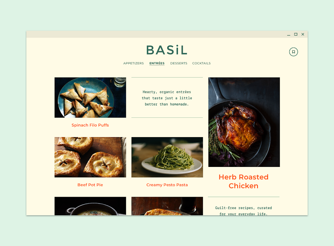
Basil’s app is divided into four top-level sections that cover different types of recipes: appetizers, entrées, desserts, and cocktails. Each of these contains a number of recipes, which contain two sub-sections: ingredients and directions.
A novel approach to navigation
While navigation drawers are often used for catalog structures, Basil’s interaction model uses a number of components to create an experience that is novel and sometimes surprising.

Desktop and tablet navigation
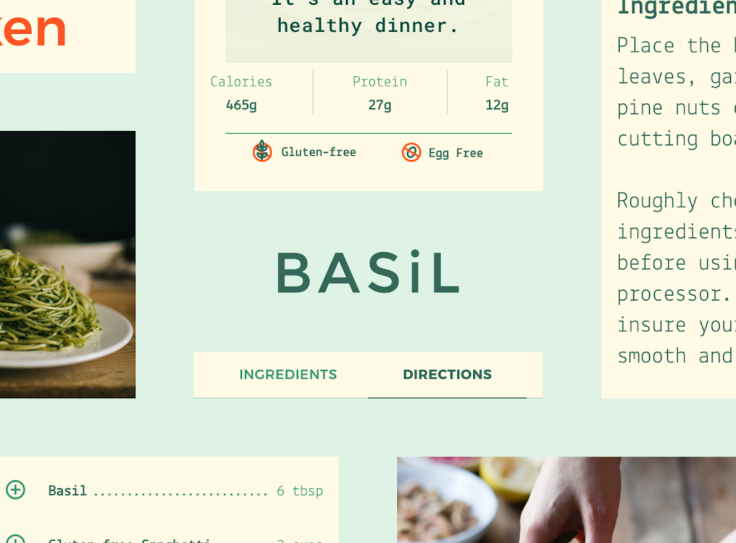
On desktop and tablet, Basil’s main sections are accessible through persistent tabs. Vertically scroll each section to browse recipes on desktop, and horizontally scroll to...
On desktop and tablet, Basil’s main sections are accessible through persistent tabs. Vertically scroll each section to browse recipes on desktop, and horizontally scroll to browse on tablet.

When a recipe is selected, tabs are used to toggle between ingredients and directions. Directions are displayed using a customized stepper component.

Layout
Grid system
Basil uses a responsive grid system, which has flexible columns and padding that can resize depending on the screen width (such as mobile, tablet, or...
Basil uses a responsive grid system, which has flexible columns and padding that can resize depending on the screen width (such as mobile, tablet, or desktop).
Basil center-aligns type to sections of its layout grid.
Basil’s headline responsively changes type size to fill the width of the screen on mobile.


Color
Color theme
The Material Design color system helps you choose colors for your user interface. Related Article arrow_downward In a UI, color has a variety of roles:...
Basil uses a color theme inspired by the deep and rich colors from fruits and vegetables:
- Basil’s primary color is olive green
- Basil’s secondary color is orange

Typography
Typefaces

2. Lekton
Type scale
Basil’s type scale uses two typefaces: Montserrat, and Lekton. The two typefaces make a quirky pair, adding to the character of Basil. Use typography to...
Basil’s type scale uses two typefaces:

Montserrat
Montserrat is a sans serif font with wide letterforms. Basil uses it as a display typeface, as well as for body, caption, and button text....
Montserrat is a sans serif font with wide letterforms. Basil uses it as a display typeface, as well as for body, caption, and button text.


Lekton
Lekton is inspired by some of the typefaces used in Olivetti typewriters. The glyphs are ‘trispaced,’ meaning they are all built using the same three...
Lekton is inspired by some of the typefaces used in Olivetti typewriters. The glyphs are ‘trispaced,’ meaning they are all built using the same three modular units. The typeface has a predictable vertical alignment of characters, similar to a monospace font. Lekton is used for Basil’s smaller headlines, and subtitles.


Iconography
Basil’s custom icons are designed with a simple, whimsical quality to help make content feel approachable.

Basil’s icons use its primary color (olive green). Basil’s secondary color (orange) is used on iconography to indicate if a food type is not included (such as gluten or dairy).

Shape
Categories
Components are grouped into shape categories based on their size. These categories let you set multiple component values at once. Shape categories include:
Components are grouped into shape categories based on their size. These categories let you set multiple component values at once. Shape categories include:
- Small components
- Medium components
- Large components


2. Medium components
3. Large components
Small components
The tooltip component has square corners with a 0dp corner radius. Component Category Attribute Value Tooltip Small components Family Size Rounded 0dp;0dp;0dp;0dp
The tooltip component has square corners with a 0dp corner radius.

| Component | Category | Attribute | Value |
|---|---|---|---|
| Tooltip | Small components | Family Size |
Rounded 0dp;0dp;0dp;0dp |
Medium components
The menu component has rounded corners with a 0dp corner radius. Component Category Attribute Value Menu Medium components Family Size Rounded 0dp;0dp;0dp;0dp
The menu component has rounded corners with a 0dp corner radius.

| Component | Category | Attribute | Value |
|---|---|---|---|
| Menu | Medium components | Family Size |
Rounded 0dp;0dp;0dp;0dp |
Large components
Standard bottom sheets (in their collapsed state) have rounded top corners with a 0dp corner radius. Component Category Attribute Value Standard bottom sheet Large components...
Standard bottom sheets (in their collapsed state) have rounded top corners with a 0dp corner radius.

| Component | Category | Attribute | Value |
|---|---|---|---|
| Standard bottom sheet | Large components | Family Size |
Rounded 0dp;0dp;n/a;n/a* |
*Bottom sheets can only shape their top-left and top-right corners.
Components
Lists
Basil displays ingredients for each recipe using the list component. Each list uses Basil’s typography and iconography, customized with a line of dots that connect...
Basil displays ingredients for each recipe using the list component. Each list uses Basil’s typography and iconography, customized with a line of dots that connect each ingredient to a quantity.

Tabs
On desktop and tablet, Basil uses tabs to navigate between sections. The tabs are distributed equally across a fixed width region, which is aligned to...
On desktop and tablet, Basil uses tabs to navigate between sections. The tabs are distributed equally across a fixed width region, which is aligned to the center of the screen.


2. Basil’s desktop and tablet navigation tabs use custom typography, color, and states. The custom selected state changes text to a heavier font weight. (Scaled down to 62.5%)
On mobile, tabs allow users to toggle between recipe ingredients and directions. By default, these tabs are displayed at the bottom of a recipe screen. Upon selection, they move to the top of the screen and attach to a surface that allows users to toggle between them.


2. Basil’s recipe tabs use custom typography, color, and states. The custom selected state includes a stroke under the selected tab text, which also changes to a heavier font weight.
Steppers
Basil uses non-linear steppers for recipe directions, so users can move between the different steps in any order they want. Steppers use Basil’s typography and...
Basil uses non-linear steppers for recipe directions, so users can move between the different steps in any order they want. Steppers use Basil’s typography and color scheme, with customized vertical spacing.

(2) Basil’s stepper appears on the right side of the screen.